These two logos belong to two cartoons created by the same person. The art styles of these shows are so similar that people theorize they take place in the same universe.
What I find interesting about their respective logos is that they basically have the same design, just applied differently. Both are the show’s title broken up into two lines, indented in opposite ways, with an object from each respective show to add flare. Despite being essentially the exact same, they feel very different. And the point I’m trying to make is that even a design as simple as this can be expressed in a huge variety of ways. This is why graphic design make me neurotic.
I’ve been continuing to develop In Search Of Adventure, and at some point I knew I would have to make a logo for it. Generally when I think about logo designs, I think about symbols like these:
Personally I think this is the stronger design approach, since if done right it transcends language. But when making a logo for a story, people tend to avoid it. Instead, the goal seems to be to make the title itself become the logo. For example:
I think I understand the reasoning. It simplifies things to have a story’s visual identifier be the same thing as its title. So for ISoA I decided to do the same.
Of course, just because I’m designing this around the title’s text doesn’t mean I can’t incorporate symbols. Portal’s logo is a great example of doing just that. So the question is what simple visuals could symbolize this story.
In Search Of Adventure is the story of Dart Friendly, a weirdly polite airhead who sets out to become a Hero and in the process succeeds only in destroying everything he loves. It’s a dark comedy, but I don’t want to present it as one. What I’m aiming for more of an off kilter vibe, where you can tell something’s not right, but in way that comes off as silly instead of creepy. “It’s fun adventure! Don’t worry about the horrors that happen along the way!” To that end I’ve already made some design choices to support this.
The big one is a consistent CMYK color pallet. Cyan, Yellow, and Magenta are the brightest and most saturated colors on digital displays. (Due to the way pixels work) And are also very rare colors to see in the natural world. That combined with the low poly CGI backgrounds should go a long way to making everything that happens in this story feel just the right kind of off.
Naturally that means I’ve gotta give the logo the same color pallet. As for the symbols, I plan on Dart’s signature weapon being a broken sword. (further adding to that off feeling) So that’s an obvious pick. But the sword alone would likely make this logo too similar to Adventure Time’s. Having these designs be too close to AT’s is a mistake across the board, because it is still far and away the fantasy cartoon. Thankfully, this sword is not the only notable weapon in the series.
Fairly early on, I’ll be introducing an important character to the story. The Greatest Hero, the guy Dart is aiming to be like. And while I don’t wanna reveal much about him just yet, I will say that his weapon is a gigantic hammer. The symbol of that hammer will be all over the series, to the extent that it’s basically the symbol of Heroes as a whole. So we have our symbols; a broken sword and a hammer. Now to make it work:
This was the first sketch I came up with, and it’s… fine. The think I like most is the way Dart’s sword is depicted as broken. It’s subtle and I think that would lead to a funny moment when people realize the sword looking broken is the point.
But in practice I think it leaves a lot to be desired. I would describe this as serviceable. It works. But it doesn’t really stand out, and the low resolution (meant to emulate the look of old videogames) just makes it harder to read. The text obscures the hammer and the colors feel a bit weak. So I made a second attempt.
And this one was quite a change! The name of the game here was to make things more dynamic, and I think I may have gone a bit too far. I liked this design a lot, (especially the pink impact effects for the hammer striking and the sword breaking) but the text is so skewed its unreadable from a distance. The colors were also now too bright. But these were fairly small things that could be changed while making the final draft.
And to make it, I decided to use Blender. The logo emulates perspective, so I thought why not have the perspective be real? Ironically doing that didn’t look very good, and I had to cheat the visuals with forced perspective and camera tricks.
But I still feel this was worth doing because it gives me a lot more room to possibly animate this logo in the future. I’ll spare you the millions of little revisions I spent days making after finishing this and jump straight to what is (probably) the final result:
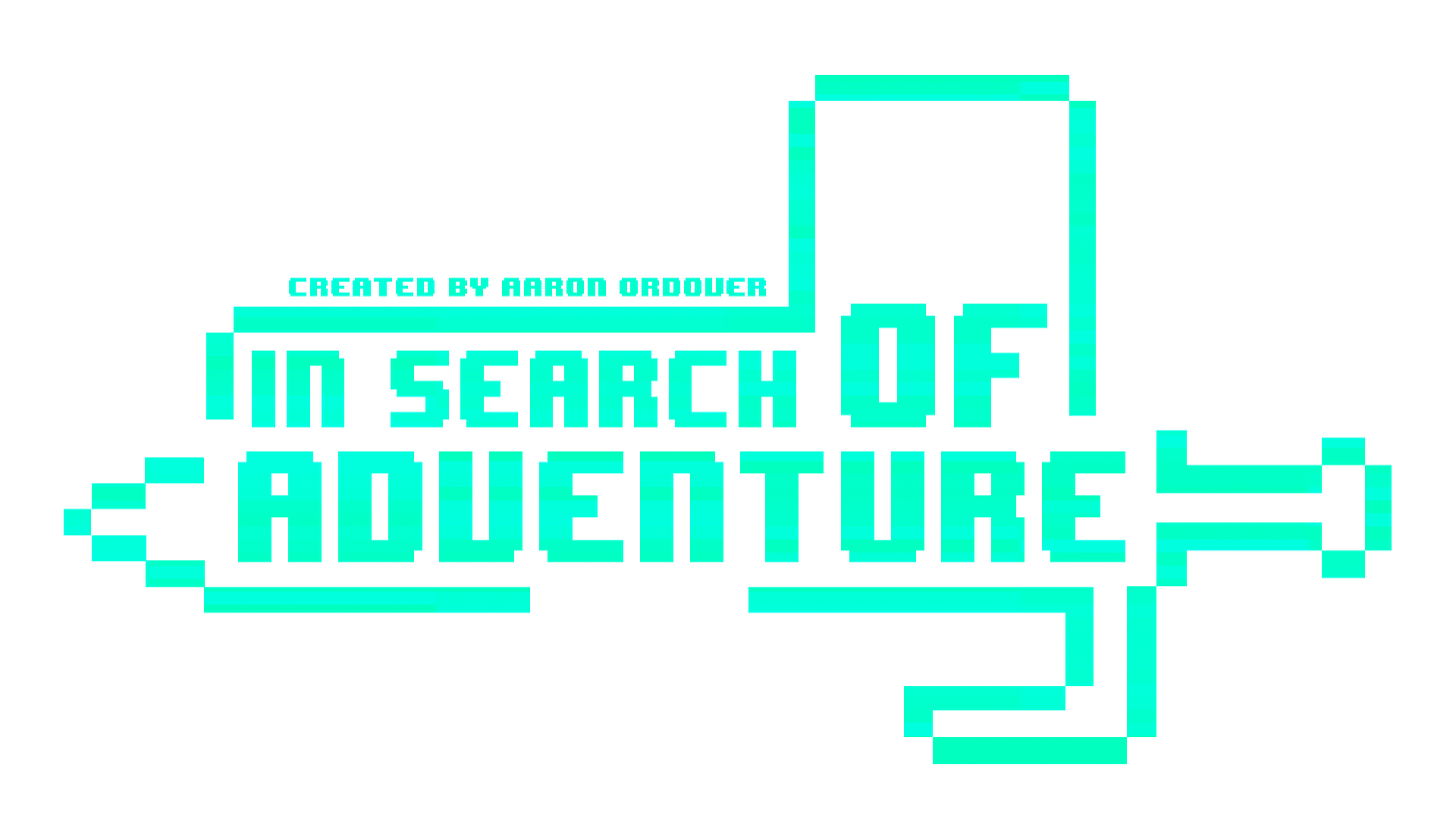
The colored halftone pattern on the text was a suggestion from a friend. It took some fiddling to make it not disrupt readability, but I like the results. Ultimately this logo still suffers when being viewed from a distance, so to compensate I made a simpler variant that kept with the retro-game aesthetic.
And with that, this step of the process is more or less done! I plan on using these two logos interchangeably, which is a bit unconventional, but since they are fundamentally the same design, I think it will work. (I’ll just have to make sure I consistently use them together)
If you’ve got any feedback about the designs, I’d love to hear it! I’m still months out from releasing the first episode of this, so there’s plenty of time to make changes.


